LinkedIn Ad Specs and Dimensions 2026
LinkedIn is where professional credibility is everything — and nothing undermines it faster than an ad that looks sloppy, stretched, or poorly formatted. With a unique mix of ad formats spanning Sponsored Content, Carousel Ads, Message Ads, Dynamic Ads, and Text Ads, each with their own precise requirements, the margin for error is surprisingly slim. This cheat sheet brings every LinkedIn ad dimension, file size, aspect ratio, and character limit together in one clean, scannable reference — so every campaign you run looks as sharp and professional as the audience you're trying to reach.
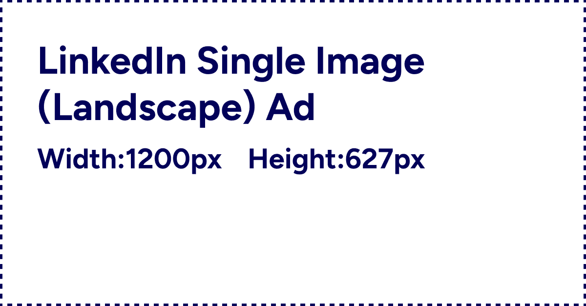
LinkedIn Single Image (Landscape)
A professional image ad used for B2B lead generation in the feed.
Dimensions:
Width in pixels:
1200
Height in pixels:
627
LinkedIn Single Image (Square)
A modern 1:1 format for LinkedIn's professional networking feed.
Dimensions:
Width in pixels:
1200
Height in pixels:
1200

LinkedIn Single Image (Vertical)
A portrait format that works best for high mobile engagement.
Dimensions:
Width in pixels:
720
Height in pixels:
900

LinkedIn Carousel
A series of swipeable cards used to tell a story or showcase products.
Dimensions:
Width in pixels:
1080
Height in pixels:
1080

LinkedIn Video Ad (Landscape)
Horizontal video format for detailed B2B professional storytelling.
Dimensions:
Width in pixels:
1920
Height in pixels:
1080

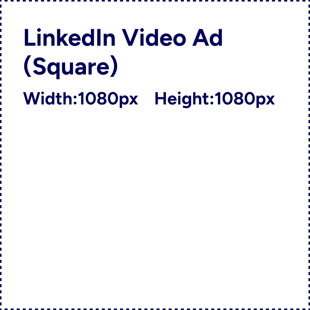
LinkedIn Video Ad (Square)
Video format optimized for cross-device visibility in professional feeds.
Dimensions:
Width in pixels:
1080
Height in pixels:
1080
LinkedIn Video Ad (Vertical)
Mobile-first vertical video for high-impact LinkedIn campaigns.
Dimensions:
Width in pixels:
1080
Height in pixels:
1920


